Fink - hjem til dit liv

From Construction Company to Housing Brand
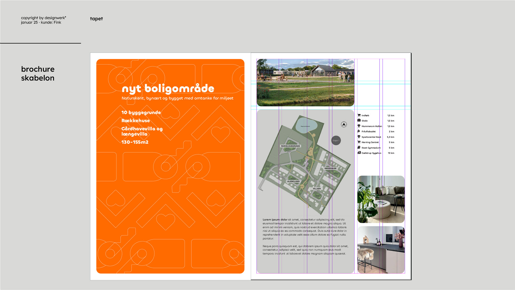
FINK has grown from a well-run construction company into a leading brand in the housing market. Based on its own projects, it develops residential areas where people’s lives and communities are the focus – not just bricks and square meters. This is reflected in the architecture, in shared facilities, in the local ecosystem, and in proximity to nature. And on the journey towards solutions that minimize environmental impact. Designwerk has developed FINK’s new visual identity – in close collaboration with the company’s key persons. From the new payoff “home to your life” to the logo, typography, color palette, icon set, graphic patterns, and a comprehensive design system for internal use – templates for everything from signage and brochures to emails and presentations. The style is a contemporary interpretation of Bauhaus, inspired by the vision of the New European Bauhaus – an aesthetic, responsible, and inclusive approach to the urban environments of the future.